The Cube https://www.youtube.com/watch?v=YnuRpHkg0H8
The opening to this particular film shows a few credits and introduces us to
the producers of this film, after the credits fade the next shot shows a close
up of a characters eye moving around in a panic state. The story then goes on
to show us the setting in which this character is in, we get shown a very
small clip of the movie to give the idea of the film. After the final shot the
scene fades to white where small rectangles and squares start appearing the
create the word CUBE, the shapes are cleverly significant as the film is about
a cube.. Although the letters are white they are outlined by black, this helps
the letters to stand out. The shot then wipes to a black background with white
outlines to highlight the letters even more. The title is quite large to
attract attention, and there is quite off screen non-diegetic music that slowly
gets louder as the title begins to form shape, this could be to create a feel
to the film. The title being "The Cube" doesn't give away much to the target audience apart from the fact it involves a cube of some sort, however it could be a give away for the thriller type genre as the well known popular puzzle game 'Rubix Cube' is much like this film and is very much puzzle-like. The target audience for this particular film is a 15 meaning it has mild peril and not overly shocking scenes within it. When the title shots come on and the screen flickers to the opposites from white background and black writing to black background and white writing this suits the genre of the film because it cuts very quickly and is short and snappy so with the background music it creates and suspense and tension, it also makes the film seem more dark and sinister.
.


This opening title is very short however they use very significant details
to relate the title to the film itself. The word Gravity is a very obvious
title as the film is based on being in space, to emphasise this, the word
Gravity is put on a black background with bold white words to make it stand
out howver there are no credits. The letters to spell the word are also incredibly spaced out again
relating to the subject of space and that there is nothing holding the letters
together. The title is quite large so you would be unable to miss it when it
cuts on, the music also starts quite low and gets louder as the sequence goes
on to draw the audiences attention and build suspense. The title of this film does create suspense as it cuts on to the screen, this film is a 12A because they're aren't many upsetting or gruesome scenes, and the language is appropriate for almost all. The genre of this film isn't particularly shown very well through the title scene however it does tell us a lot about the story line and creates a build up for the audience to preview this.

Cabin in the woods https://www.youtube.com/watch?v=JyiYJhAsOeY


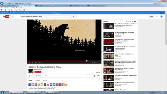
This title sequence is very interesting as it uses animation to create pictures relating to the story line. The sequence starts of presenting the producers and directors, again their names on in white font on a black background to make them stand out. The title itself is animated and fades in after the animation below it, the background is a cream colour with black font at the top centre of the page which makes it easy for it to be seen.The animation below it is of a cabin surrounded by trees, there are all in black, this particular shot is very important for the audience to understand as it corresponds with the title immensely. As the shots go on we see more credits of the actors in the film, the animation takes us inside the cabin, the shots being all in black and cream. During being taken through the animation a low deep music played by mostly string instruments play in a off-screen non diegetic way, as we go further into the animation the music becomes more sinister and dark using lighter instruments such as chimes or the triangle. The animation is a very effective way to present the opening titles as they keep your attention as there is always something going on. I think that the genre of this film is shown very clearly through the title sequence as it has a sinister feel for it and the music portrays that very well as in the background you can also hear a bell ringing which may be heard at an execution. The genre could be slightly confused with horror although it is a hybrid, it could be confused by the supernatural animations in the first few shots. The target audience of this film is a 15, I think this is appropriate for the film however I think it could borderline on being an 18 as it is very graphic and could be seen as much worse than most other thrillers and definitely not appropriate for some 15 year olds.
This is far too brief lots more analysis needed Annie. Remember your textual analysis key terms do not just describe analyse there also needs to be three, please post the final one
ReplyDelete